

Havenly
Roommate/Apartment Matching Mobile App
Product Designer (UX/UI) • End-to-End Design • Research to Prototype
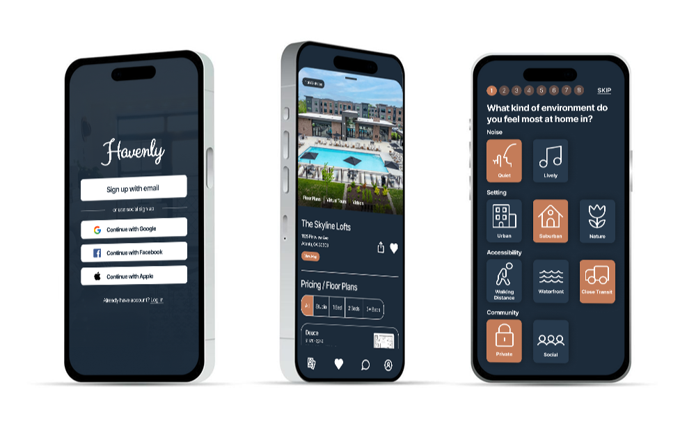
i. Overview
Finding roommates and apartments is fragmented, time-consuming, and often based on incomplete information. Havenly was designed to simplify this process through a compatibility-driven matching experience.
ii. Opportunity
There is a gap in the market for a more intuitive, compatibility-focused way to find roommates and apartments. By combining matching mechanics with user preferences, Havenly creates a faster, more personalized path to better living situations.
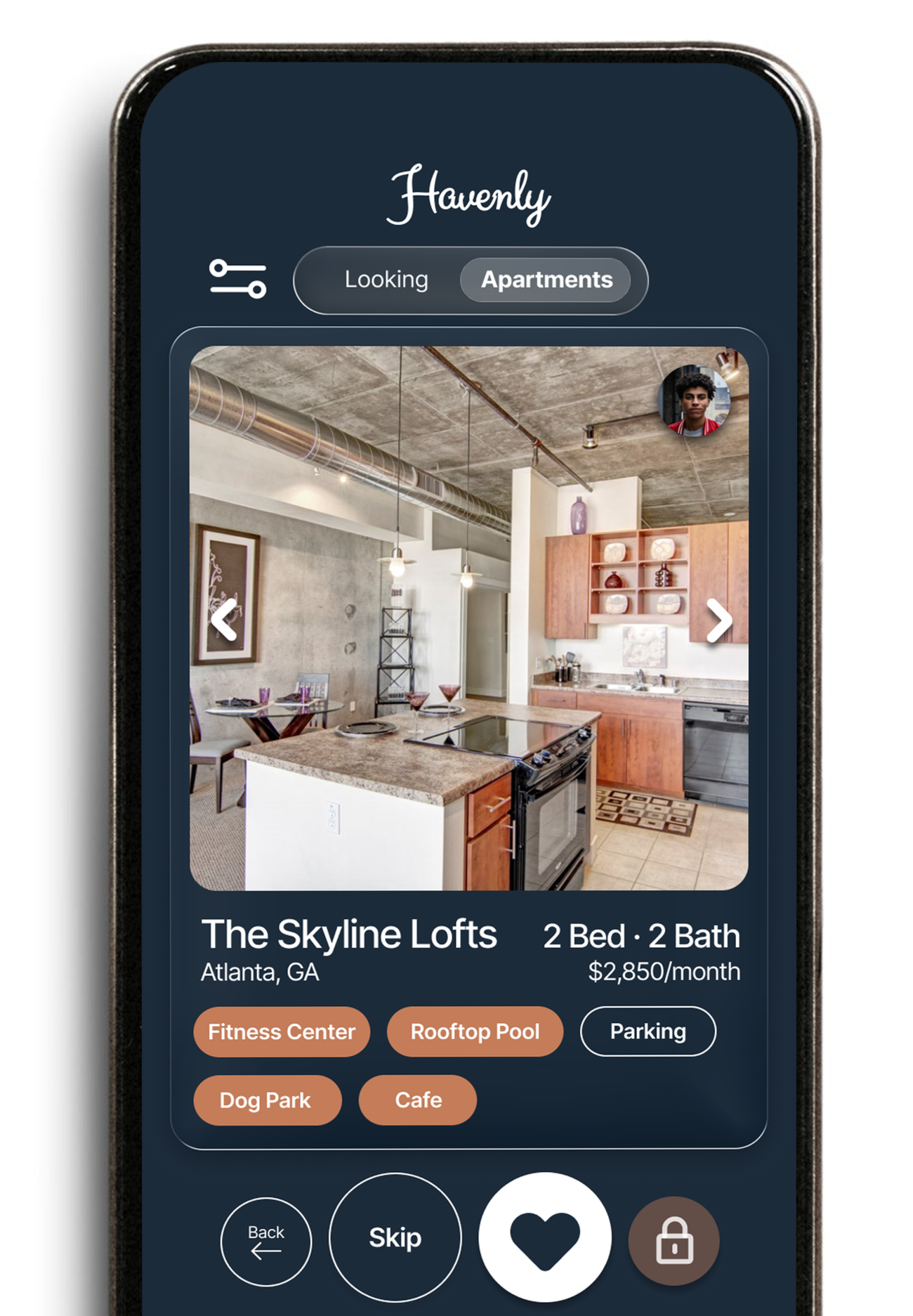
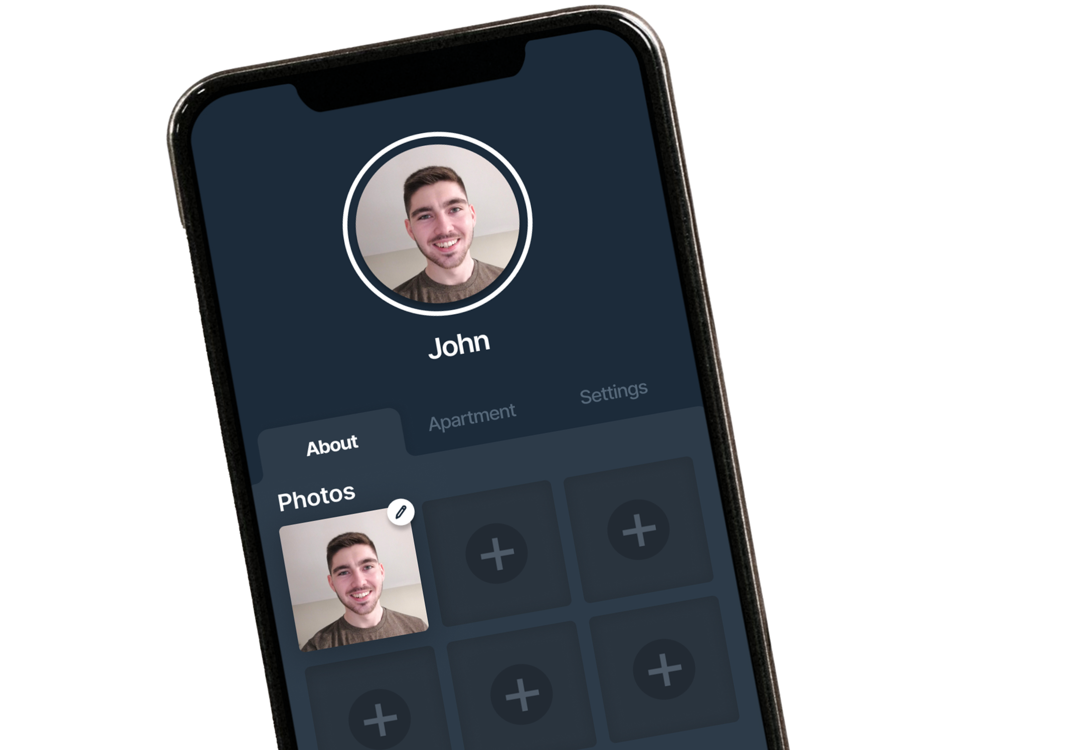
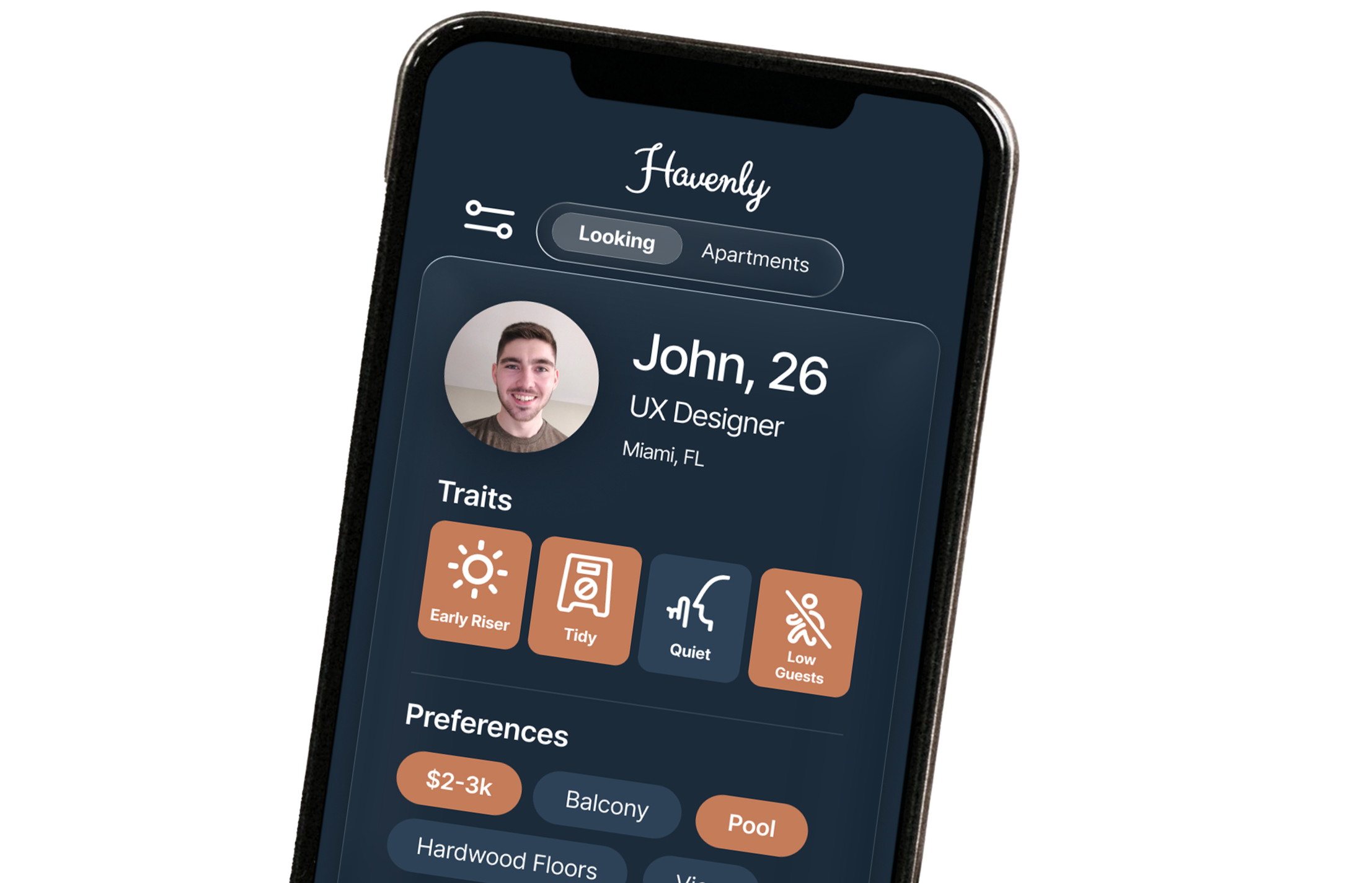
Pictured here: The finished screens of the profile page, apartment matching page, and roommate matching page.
iii. Research
Conducted research to understand how people currently search for roommates and apartments, identifying key frustrations, behaviors, and decision-making patterns.
Started with some interviews.
Process
Interviewed 10 renters actively searching for roommates or apartments

Key Findings
Users rely on multiple platforms during search, compatibility is unclear early, and profiles lack lifestyle information.

The insights from the interviews led me into running surveys.
Process
Short, targeted user survey. Ages ranged from 21-38.
Key Findings
Users currently have to rely on inefficient, inconsistent search methods.
Insights
Users don’t just need listings or options they need to be compatible with their living environment.

Insights
Simplicity helps drive better experiences. Also speeds everything up.
iv. User Flows
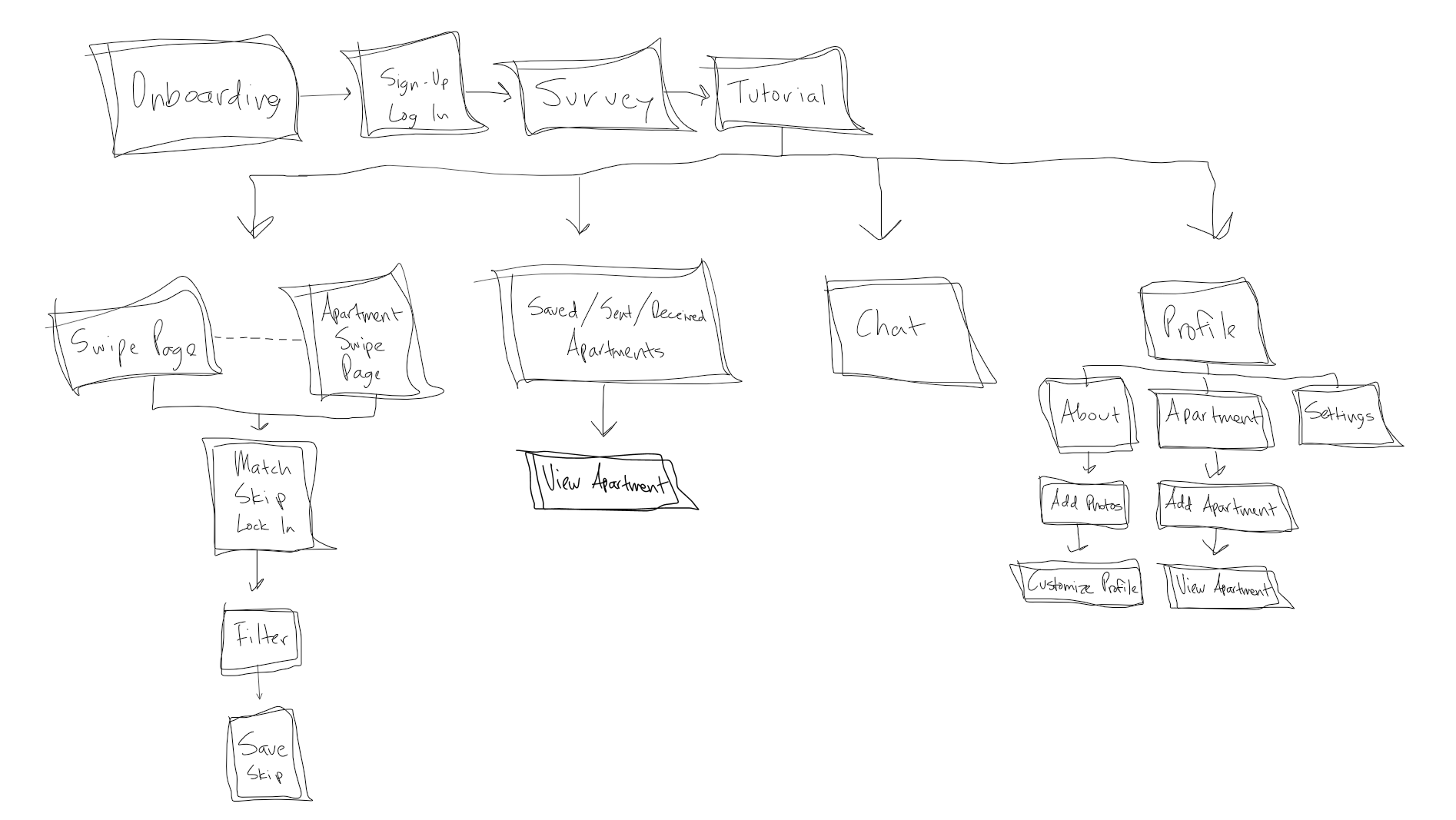
After receiving insights, it was a lot easier to move forward into a user flow which is seen here. This is a very simplified version of the general flow of the entire app. I started with 4 pillars and made more detailed user flows for each pillar. This generalized user flow you see here allowed me to keep the structure of everything consistent.
v. Design Process
The design process was carried out in Figma, working through one screen at a time while building toward a consistent system across the entire product. A component library (button and UI component system) was created early on to keep interactions and visuals consistent, especially across different touch areas. From there, the process was very iterative—I would build a screen, run through the flow, notice what felt off, and adjust in real time. A lot of it was testing the experience as I went, constantly simulating how a user would move through each action and refining anything that slowed things down or created confusion. Since speed was the most important factor, every decision came back to simplifying—reducing steps, tightening layouts, and making interactions more direct while still keeping enough information on screen. It wasn’t a straight line process, more like building, testing, fixing, and repeating until everything felt smooth, consistent, and made sense as a complete experience.
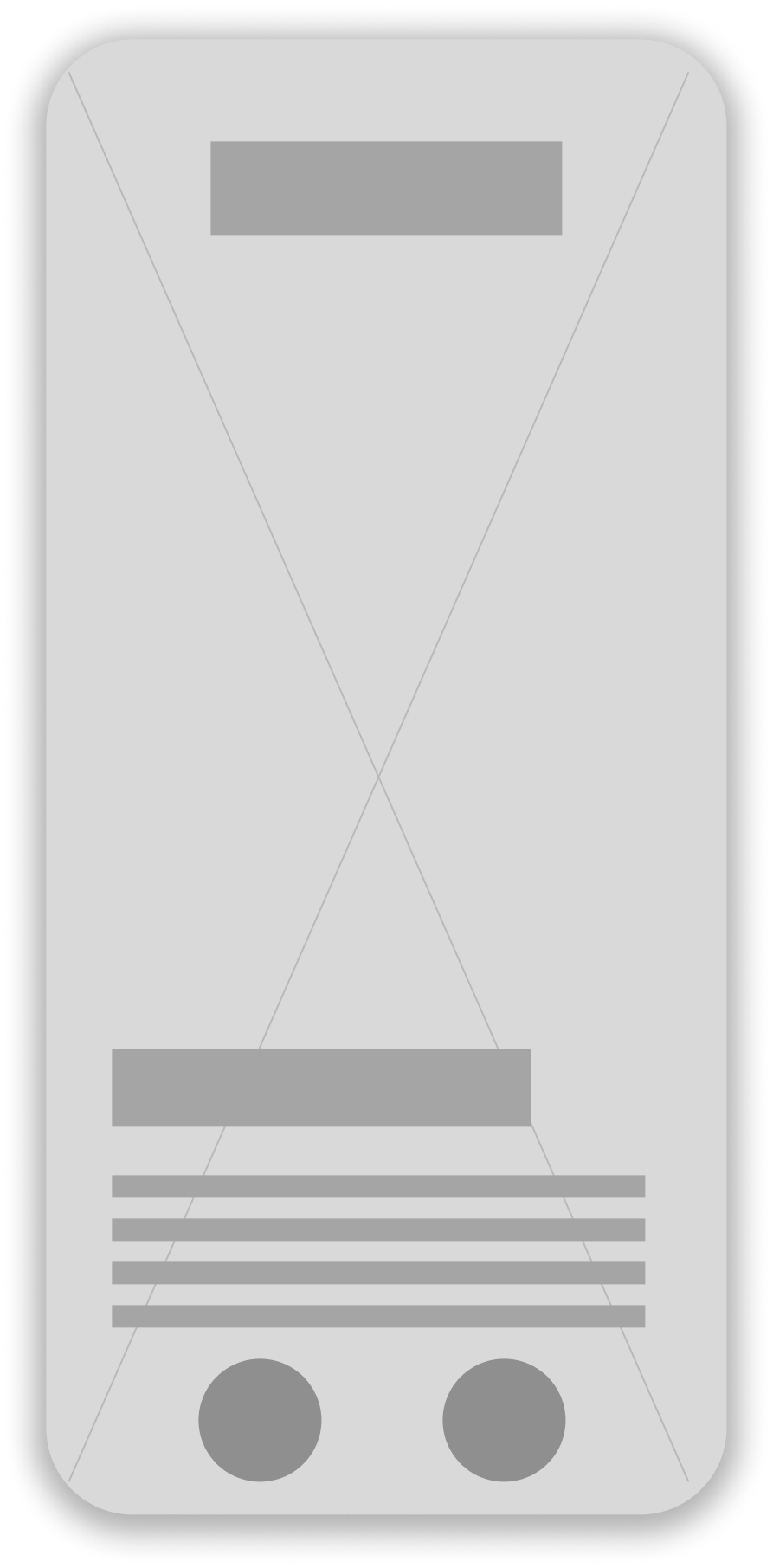
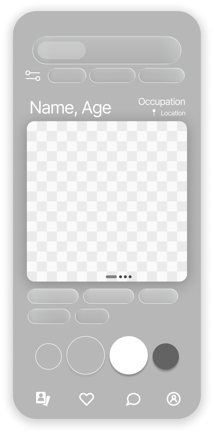
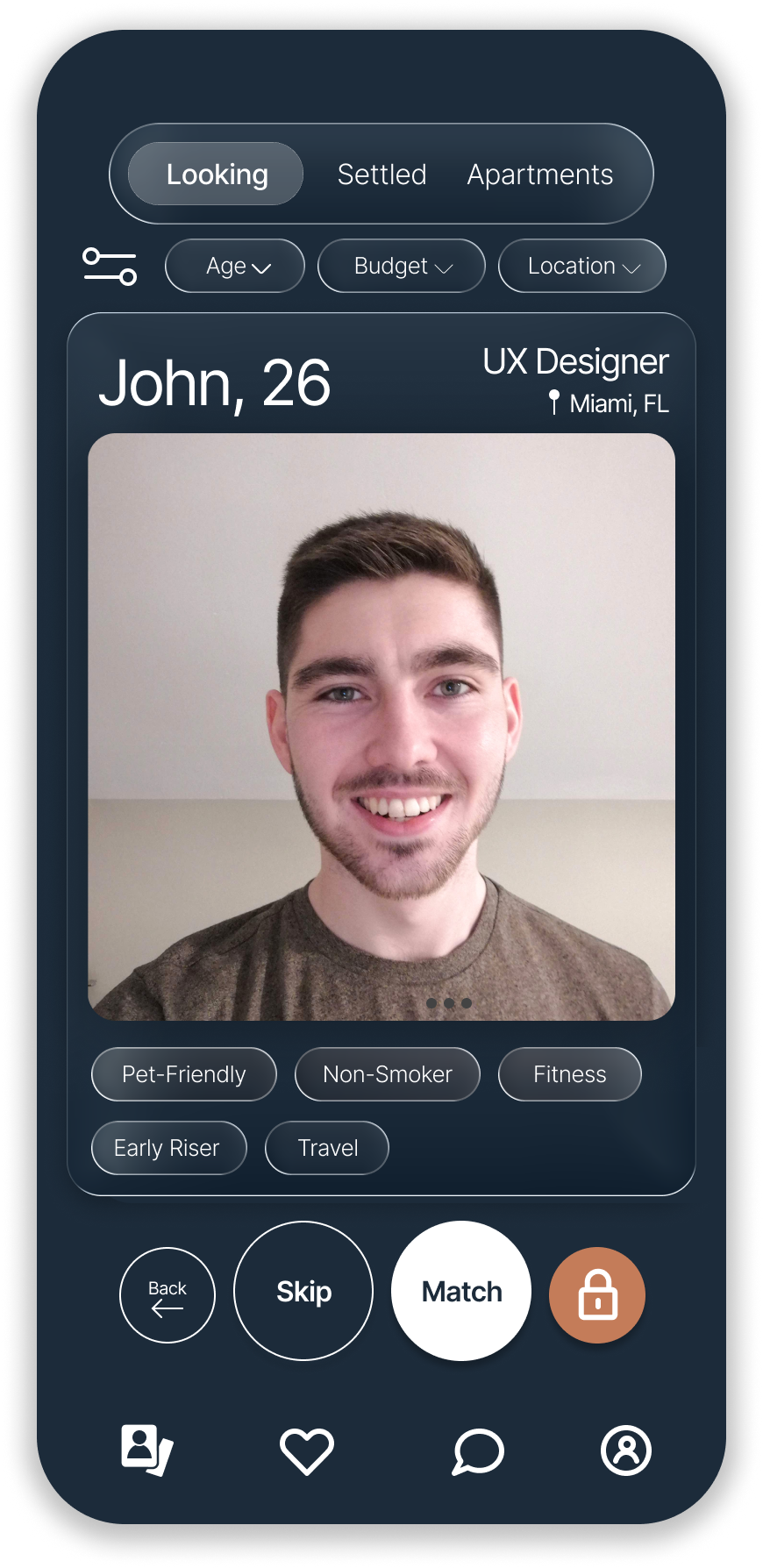
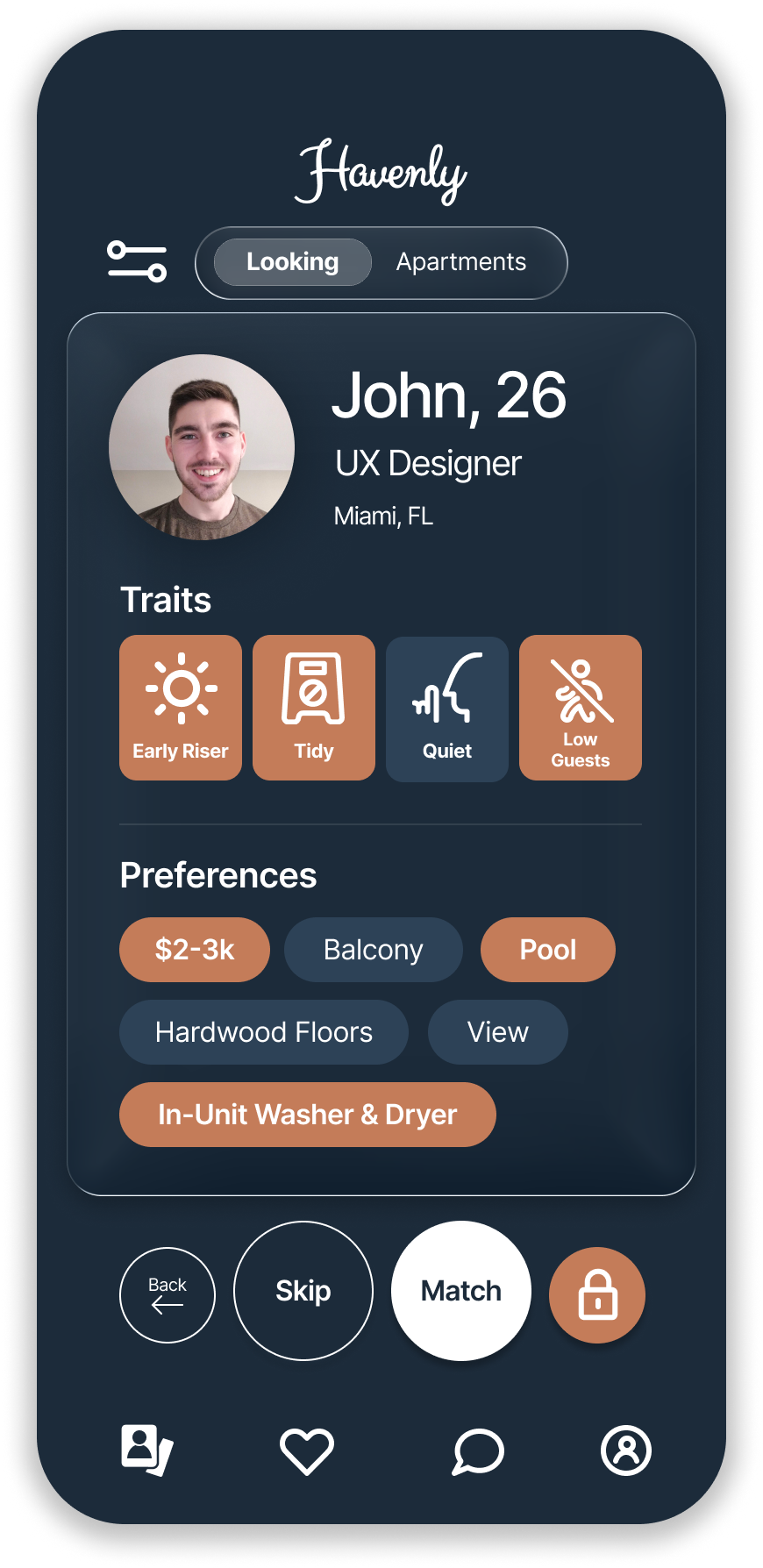
Pictured here: The process from the first iteration of the home page to the final iteration.
Orange means there is a similarity in both users.
vi. Prototyping
An interactive prototype was developed using the final screens to simulate the full product experience and bring key flows to life. Instead of viewing designs as separate screens, the prototype allowed the product to function as a connected system, making it easier to understand how users would actually move through tasks from start to finish. This helped highlight how different touchpoints interacted with each other and whether transitions felt smooth and intuitive. The focus throughout was on maintaining a consistent aesthetic while ensuring every interaction supported speed and ease of use. By experiencing the product in motion, it became easier to identify where things felt too heavy, too slow, or unnecessarily complex, and where simplification would improve the overall flow.
vii. Evaluation/Testing
The prototype was used to evaluate how effectively the experience supported fast, efficient task completion and whether any part of the flow created friction. The evaluation focused on how quickly users could move through core actions, how clear each step felt, and how well touch interactions supported a seamless experience. Since speed was the most important attribute of the product, particular attention was given to identifying moments where users might hesitate, tap multiple times, or feel slowed down. This process reinforced the idea that simpler interactions consistently led to better outcomes, and it helped surface small but important refinements in layout, navigation, and interaction design. Overall, the evaluation confirmed that reducing steps, clarifying actions, and tightening the flow created a more intuitive and efficient experience.
viii. Core Product Flows
These flows represent the core functionality of the product, highlighting how users complete key actions quickly and intuitively. Each flow focuses on speed, clarity, and reducing friction across the experience.
Onboarding
A quick onboarding flow that learns the user’s noise, environment, and community preferences. This sets the foundation for personalized apartment and roommate matching.
Swiping & Filters
Users come from their onboarding experience to here where they can quickly find apartments and roommates that match their lifestyle and adjust filters without breaking flow.
Saved Apartments
A clean, organized profile that highlights lifestyle traits, preferences, apartment details, and photos—giving others a clear sense of compatibility at a glance.
Profile
Users can revisit favorites, view what they’ve shared, and see matches shared with them—all in one place.
ix. What Went Well?
User research gave me a clear direction early in the process. Interviews revealed that users struggled to compare apartments across multiple platforms and had difficulty judging roommate compatibility beyond basic demographics. This led to features like lifestyle-based environment tags, roommate preference matching, and swipe cards that combined key information into a single view, making decisions faster and easier.
x. What Didn’t Go So Well?
I initially explored more detailed matching systems and additional profile features, but they added complexity without improving the core experience. Testing also revealed that some information-heavy screens created decision fatigue, which required simplifying layouts and reducing the amount of content shown at one time. These changes reinforced the importance of prioritizing clarity over feature quantity.