

Stockwise
Inventory Tracking Mobile App
Product Designer (UX/UI) • End-to-End Design • Research to Prototype
i. Overview
Managing retail inventory is often manual, inconsistent, and prone to costly errors due to scattered systems and lack of real-time visibility. Stockwise was designed to streamline inventory management through a centralized, intuitive experience that prioritizes clarity, speed, and accuracy.
ii. Opportunity
Given that Stockwise was developed as an internal enterprise tool for a specific organization, there was no need for traditional competitive analysis. Instead, the opportunity focused on deeply understanding internal workflows, operational pain points, and user behaviors to create a solution tailored to the company’s existing systems and processes.
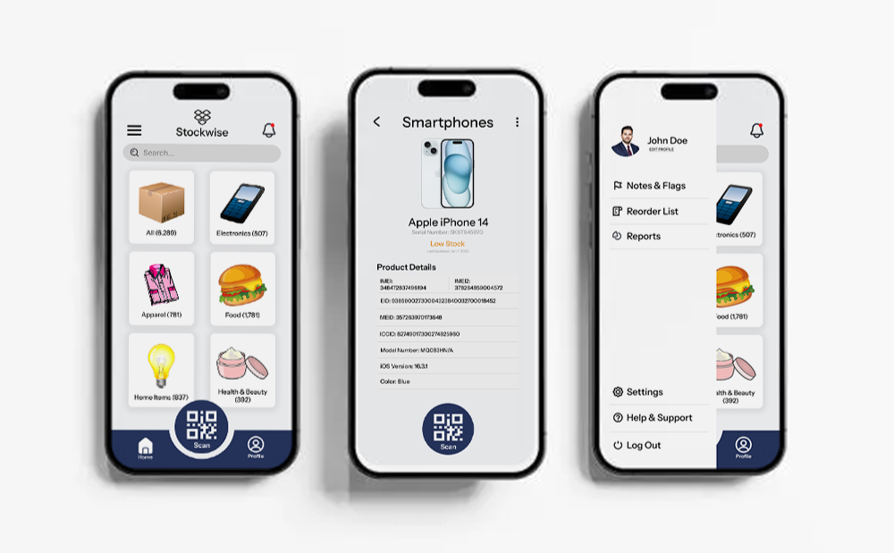
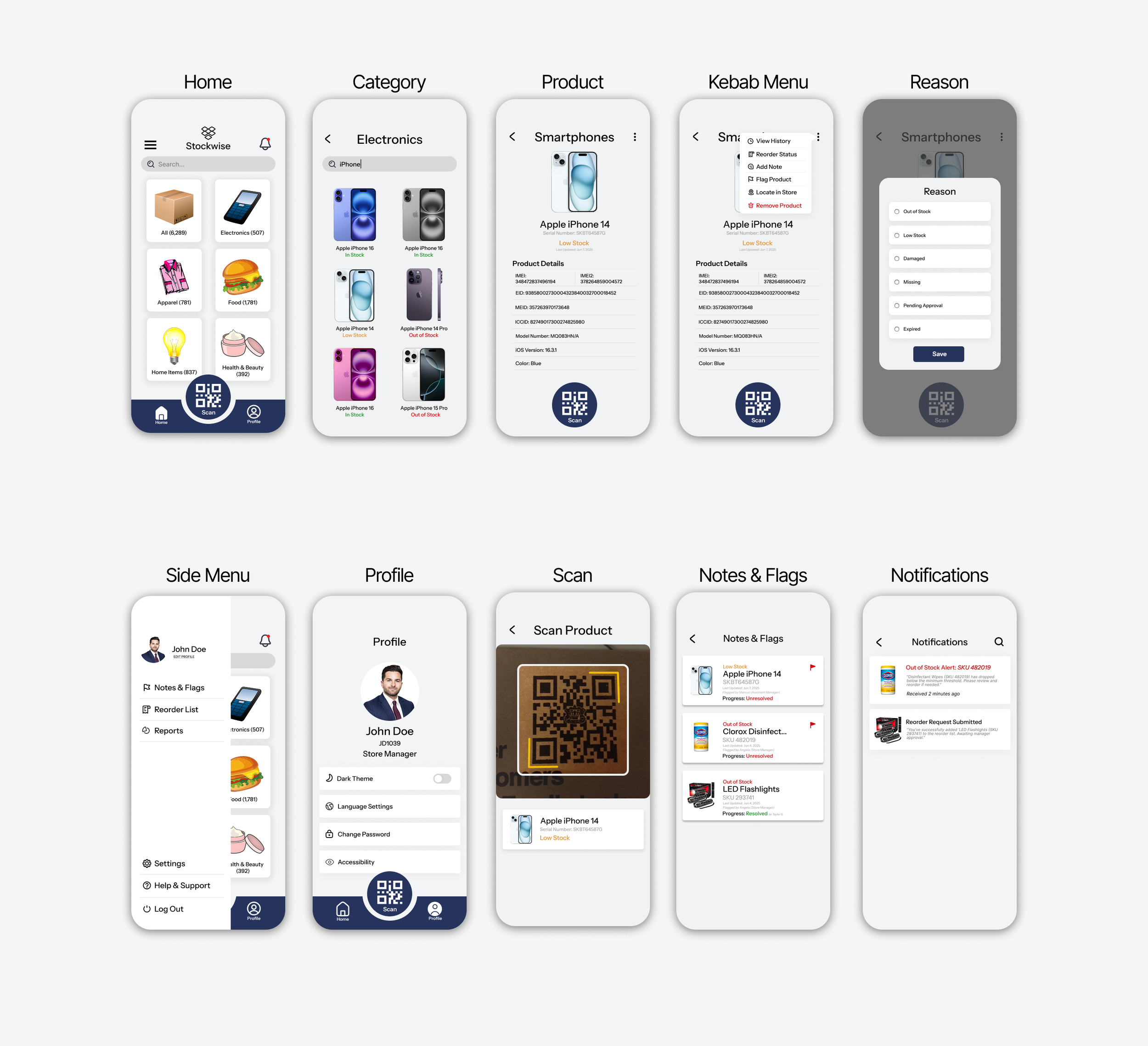
Pictured here: Finished screens of the home page, product viewing page, and side navigation menu.
iii. Research
Research was grounded in direct conversations and real-world workflows, focusing on how inventory is actually managed day to day to uncover consistent pain points and inform practical, user-centered solutions.
Started with interviews.
Process
I interviewed 5 participants, who were assistant managers and stock associates responsible for daily inventory tracking and stock management.

Key Findings
Manual entries led to frequent errors and miscounts, lack of real-time visibility made decision-making take longer, employees used a mix of personal methods (notes, memory, separate systems).

Insights
A standardized, real-time system that minimizes manual input is essential to improve accuracy, consistency, and decision-making in inventory management.

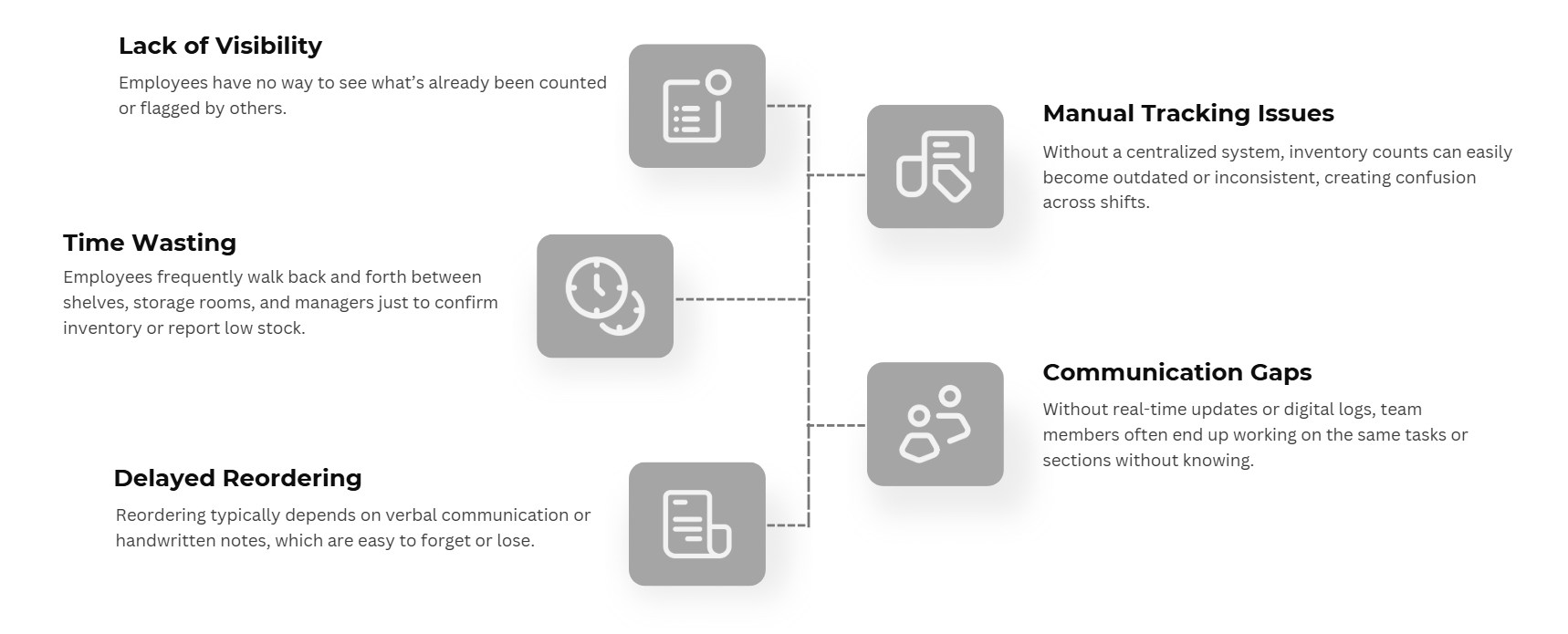
Which led to affinity mapping.
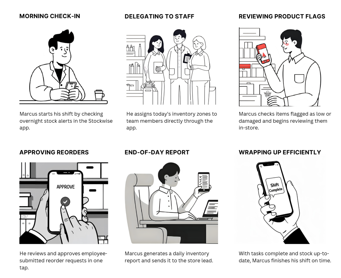
The next step involved creating a storyboard illustrating a day in the life of one of the store managers that was interviewed USING an inventory tracking application, allowing for a clearer understanding of the app’s functionality and role within daily workflows. His name was Marcus.
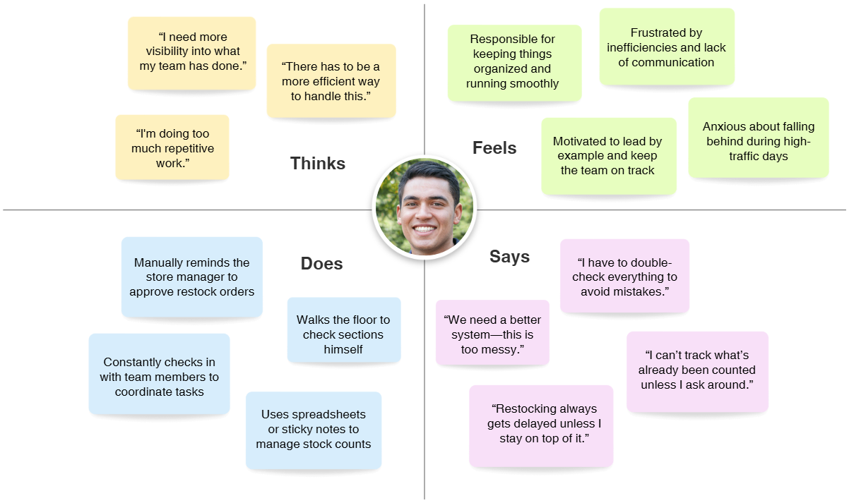
It was then deemed necessary to create an empathy map to get an understanding of the user’s (Marcus’) needs.
iv. Design Process
The design process began by directly mapping user pain points to potential features, using each problem as a starting point for solution-driven thinking. For every friction point identified in the interviews, I consistently asked questions like “How can this be resolved?”, “What would make this step easier?”, and “Can this step be removed entirely?” to guide decision-making.
A key focus was understanding how employees currently mark items as low stock, breaking down each step in their existing process to see where inefficiencies, gaps, or workarounds existed. This allowed me to identify not only what users were doing, but also what they were skipping or improvising due to poor system support. By analyzing these behaviors, I was able to simplify flows, eliminate unnecessary steps, and design features that aligned with how users naturally work rather than forcing new habits. This approach ensured that every design decision was rooted in real user behavior, creating a more intuitive and efficient inventory management experience.
With the process I just described above, these were the “must-have” functions of the app.
Barcode Scanning
Item Status Indicators
Real-Time Team Updates
Low-Stock Alerts
Reorder Requests
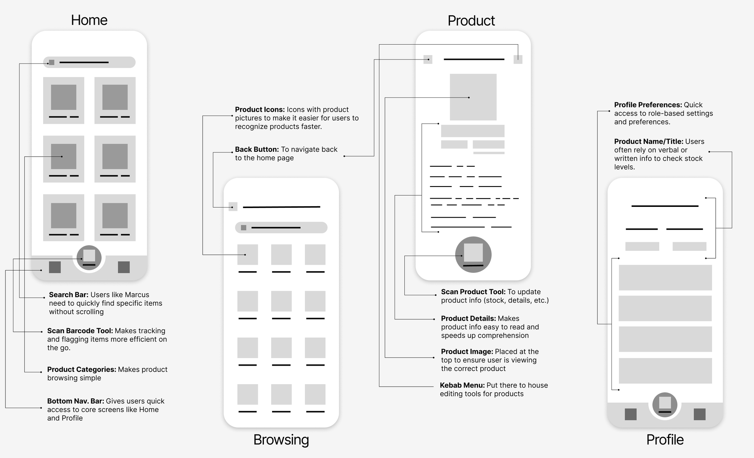
v. Low Fidelity Wireframing
vi. Mid-Fidelity
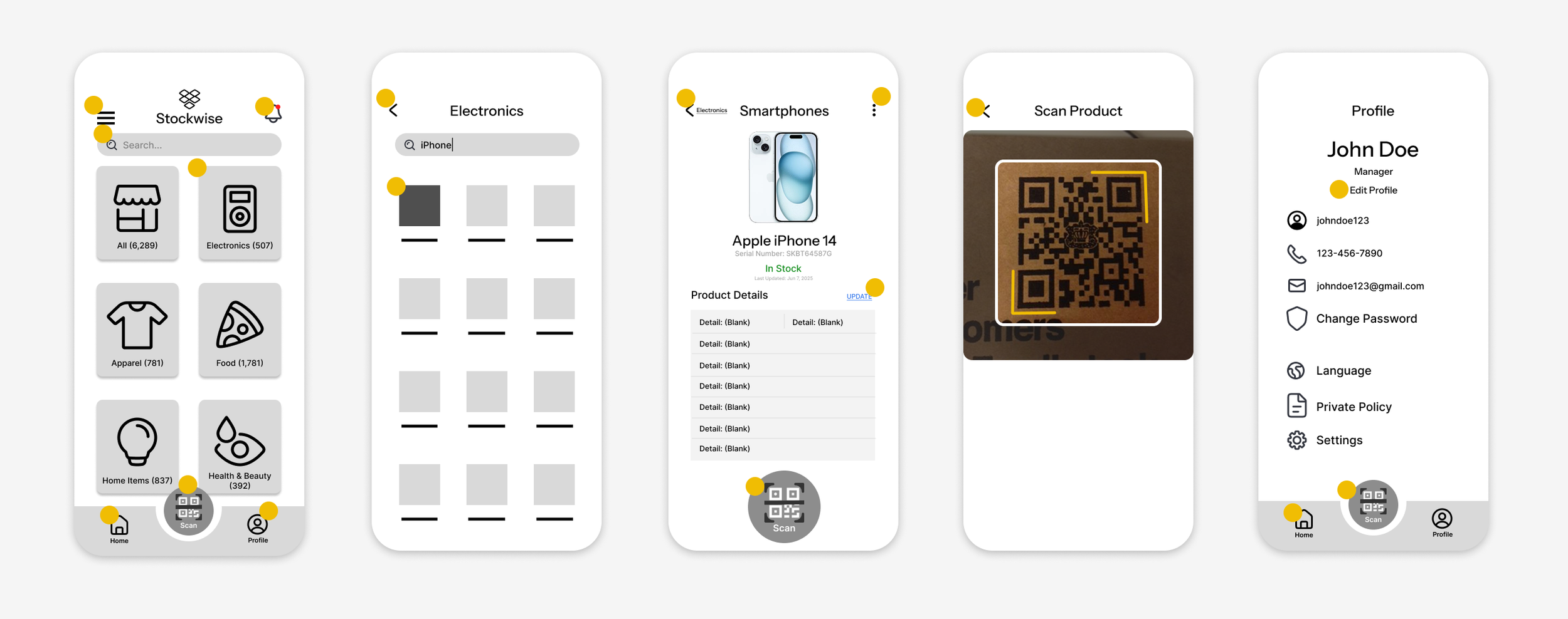
In this stage, I focused on refining the layout and getting more detailed with screen functions and feature placement. Each yellow dot represented a button or frame that will be interactive in the Figma prototype.
vii. High Fidelity
viii. Testing Usability
To validate the core functionality of Stockwise, usability testing was conducted using a high-fidelity prototype that closely represented the final product experience. The goal was to ensure that key workflows—such as adding products, scanning barcodes, and updating inventory levels—were intuitive, efficient, and aligned with how store managers naturally operate. Rather than focusing on visual polish, the testing prioritized speed, clarity, and ease of use, making sure users could complete tasks with minimal friction and without needing guidance.
ix. User Task
Users were asked to complete a key task: Flag the blue iPhone 14 for having low stock.
Avg. Time to update inventory
6 min/item
Number of steps to log new info
10 steps
Task success rate (flagging an item)
60%
Error rate (wrong item)
1 in 12
After Stockwise
1.8 min/item
x. Results
Usability Metric
Before Stockwise
40% fewer steps
89/100 - rated “Excellent”
Net Promoter Scale
+52 (Strong likelihood to recommend)
Reported Stress Reduction
68% of users said “much less stressful”
Improvement
70% faster
6 steps
95%
+35% success rate
1 in 20
75% reduction
xi. User Satisfaction
Testing confirmed that the core flow—adding products through barcode scanning and updating inventory—was intuitive and efficient, with users able to complete tasks without guidance. The results validated the decision to prioritize simplicity and speed over visual complexity, reinforcing that the current experience effectively supports real-world usage.
While no major usability issues were identified, future iterations could explore enhancing system feedback and expanding functionality, such as bulk actions or deeper inventory insights, to further improve efficiency at scale.
Metric
Feedback
System Usability Scale
xiii. What Went Well?
Research directly influenced the product's most important features. Interviews revealed that employees were spending too much time manually tracking inventory and reporting low-stock items, which led to solutions like barcode scanning, simplified inventory updates, and low-stock reporting. The final concept resonated strongly with users, and several store managers expressed interest in implementing the design within their own stores.
xiv. What Didn’t Go Well?
Early in the process, I focused too heavily on feature ideas before fully understanding operational workflows. Additional research uncovered differences in how employees and managers handled inventory, which required revisiting several screens and user flows. This reinforced the importance of validating assumptions early and allowing research—not features—to drive design decisions.