

QuikBite
Meal Prepping Mobile App
Product Designer (UX/UI) • End-to-End Design • Research to Prototype
i. Overview
Meal prepping often feels overwhelming due to time constraints, lack of variety, dietary challenges, and inefficiencies like food waste and unplanned grocery trips.
ii. Goal
To create a simple, functional, and personalized mobile app for meal planning that supports users without overwhelming them.
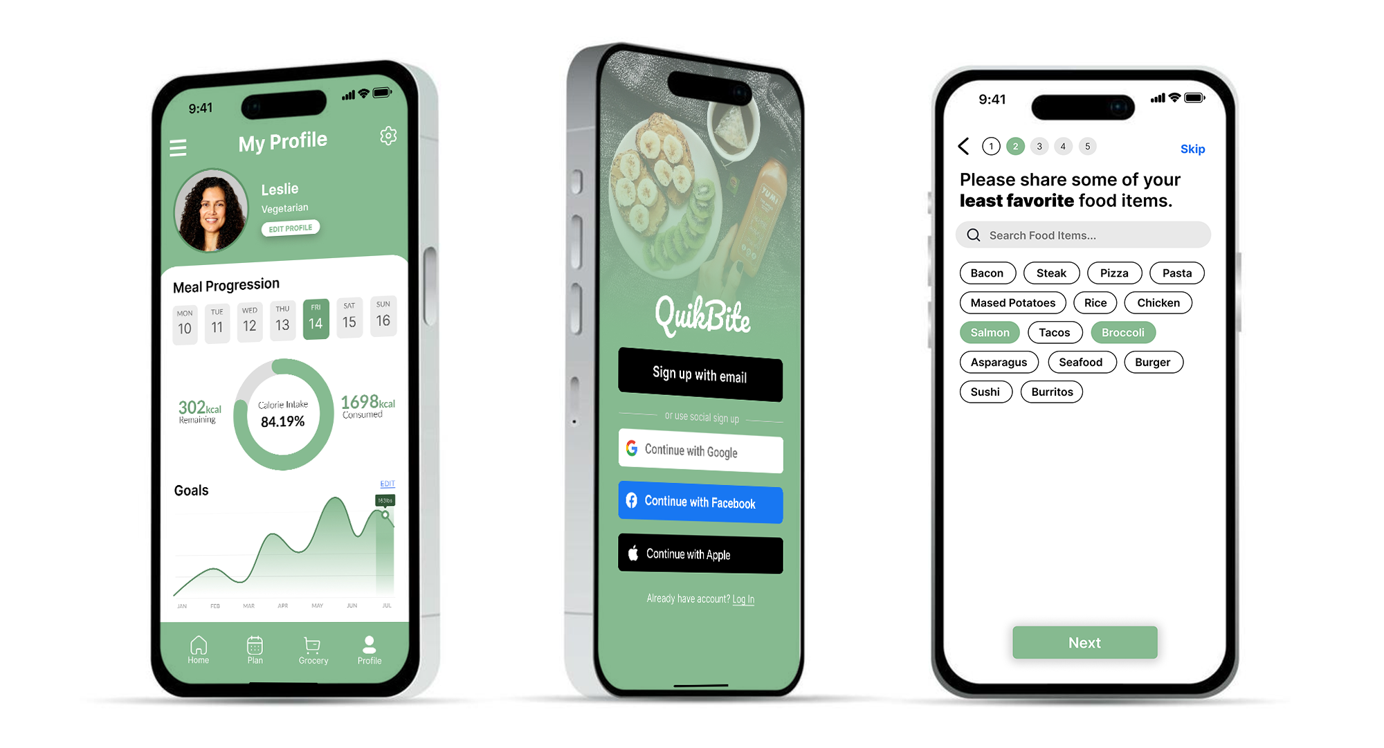
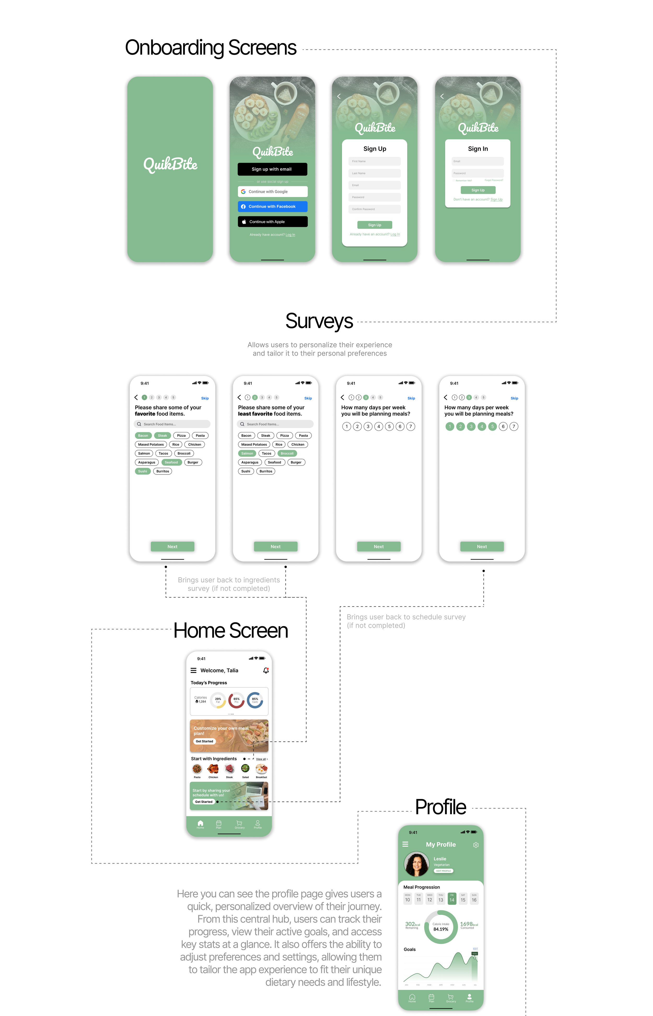
Pictured above: The finished screens for my profile, sign up, and onboarding survey pages.
iii. Research
Conducted research to better understand how users currently approach meal prepping, where they struggle, and what causes them to lose consistency over time.
Started with some interviews.
Process
Interviewed 10 users who regularly use food delivery apps

Key Findings
Users struggle with consistency and often abandon meal prepping because the process feels overwhelming and time consuming.

Then moved on to targeted surveys.
Process
Conducted short, targeted surveys. Ages ranged from 20–37.
Key Findings
Users prefer simple, visually organized systems that make planning and grocery management feel faster and easier to maintain.
Insights
Users don’t just need recipes—they need systems that make meal prepping easier to maintain consistently.

Insights
Reducing planning friction and simplifying organization creates a more sustainable experience.
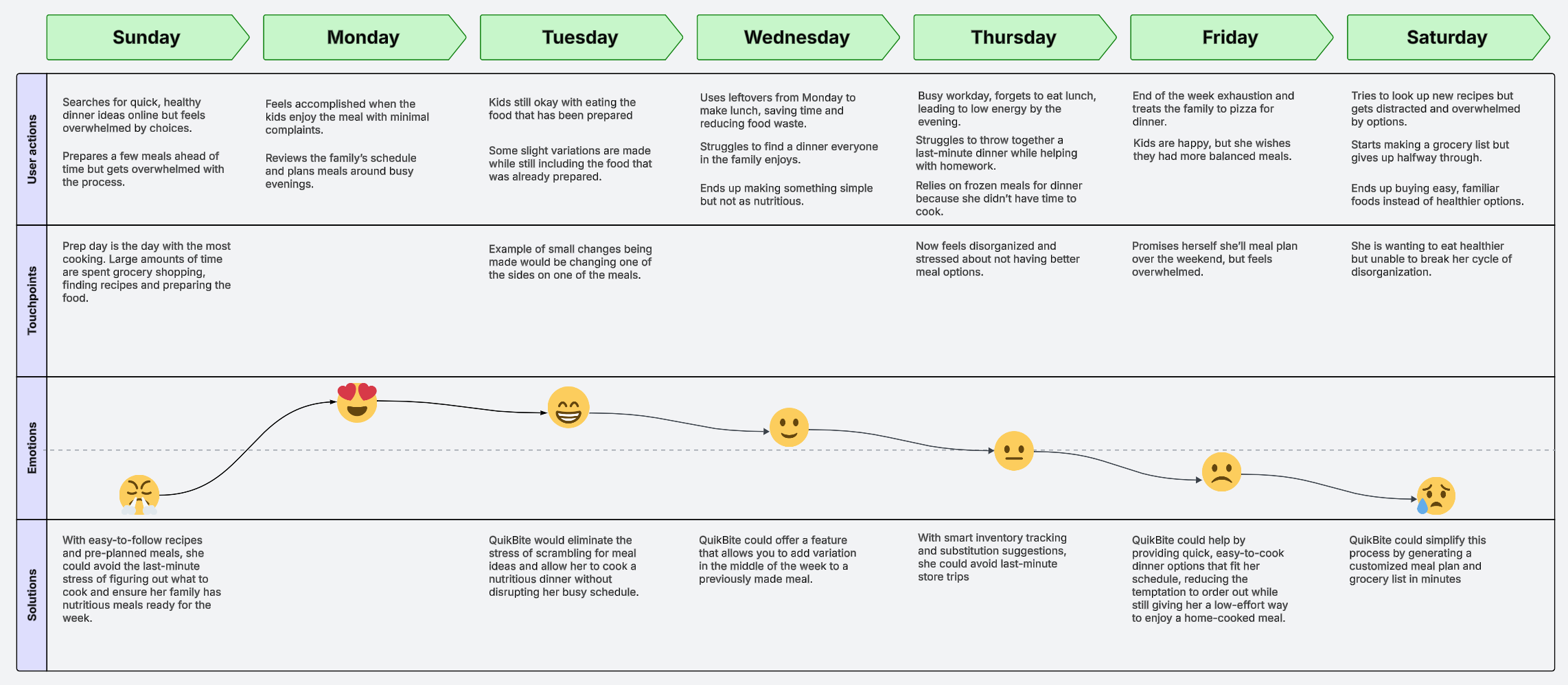
A 28-year-old mother of two was interviewed and asked about her weekly schedule. She was a perfect candidate for an example of a potential user. Cooking and prepping weekly meals not only for herself but for 2 kids can be very overwhelming.
iv. Defining
This stage was really about making sense of all the raw research and figuring out what actually mattered instead of just collecting a bunch of observations that sounded smart on paper. Once I started grouping together repeated frustrations, habits, and behaviors, clear patterns started showing up pretty quickly. Users consistently wanted the experience to feel simpler, more organized, and easier to maintain long term without meal prepping turning into a chore after three days. That process helped narrow the focus of the product around reducing friction, keeping things consistent, and making the overall experience feel less mentally exhausting.
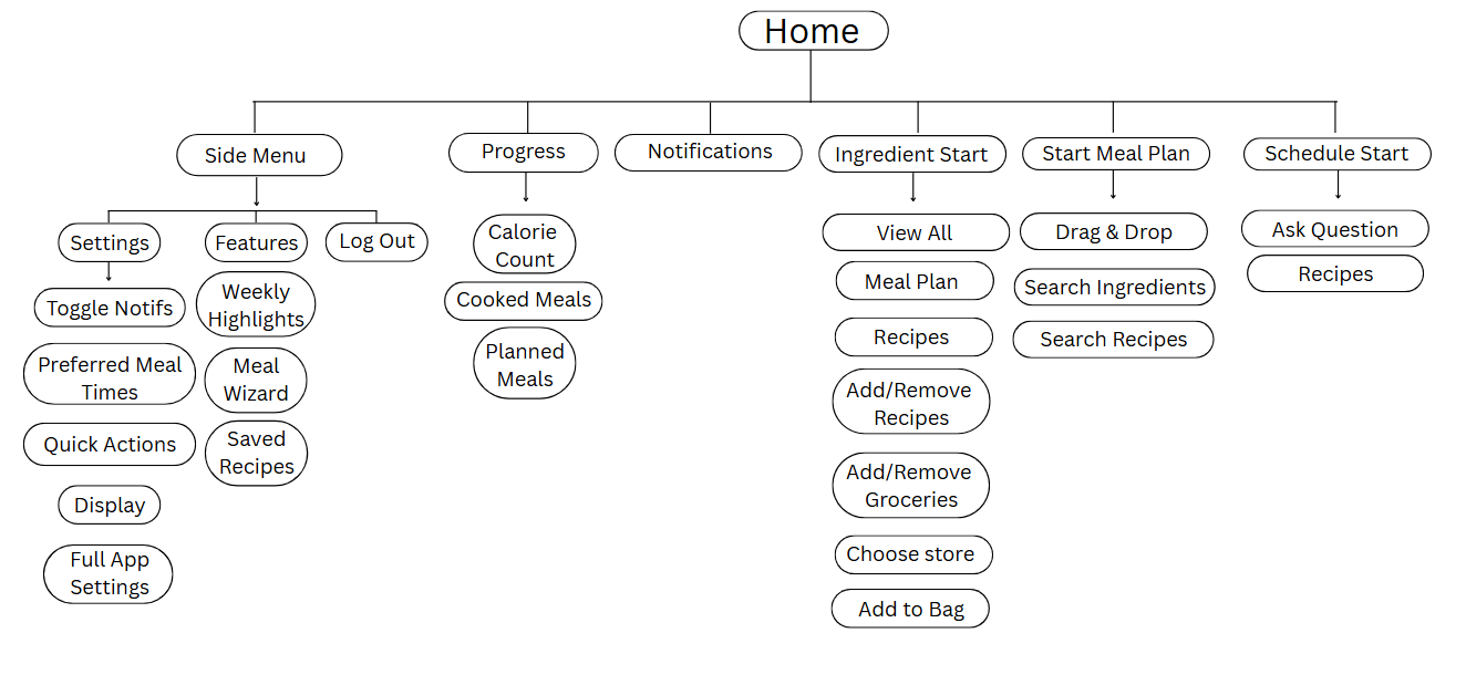
User Flow Chart
The user flow chart mapped the core paths users take to reach their goals, helping me visualize the app’s structure, anticipate decisions, and spot friction points early.
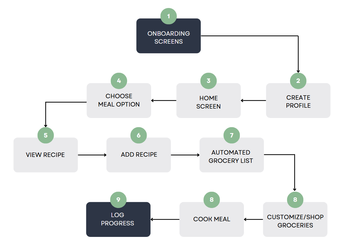
After making a general user flow of how the app will function. I was able to get more detailed into individual flows. This example is showing out the home screen will function.
Defined User Flow
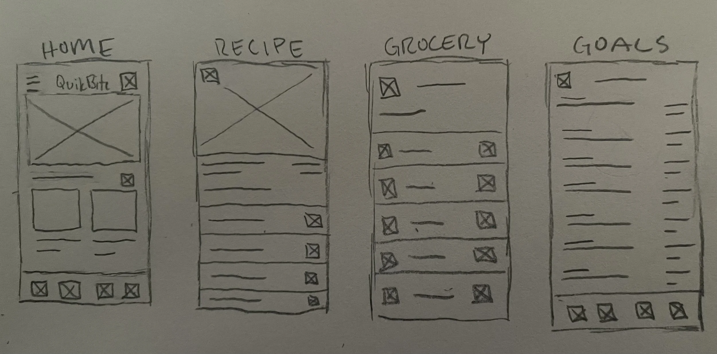
Sketches
Sketching allowed me to explore ideas rapidly, visualize features, and refine designs around user needs.
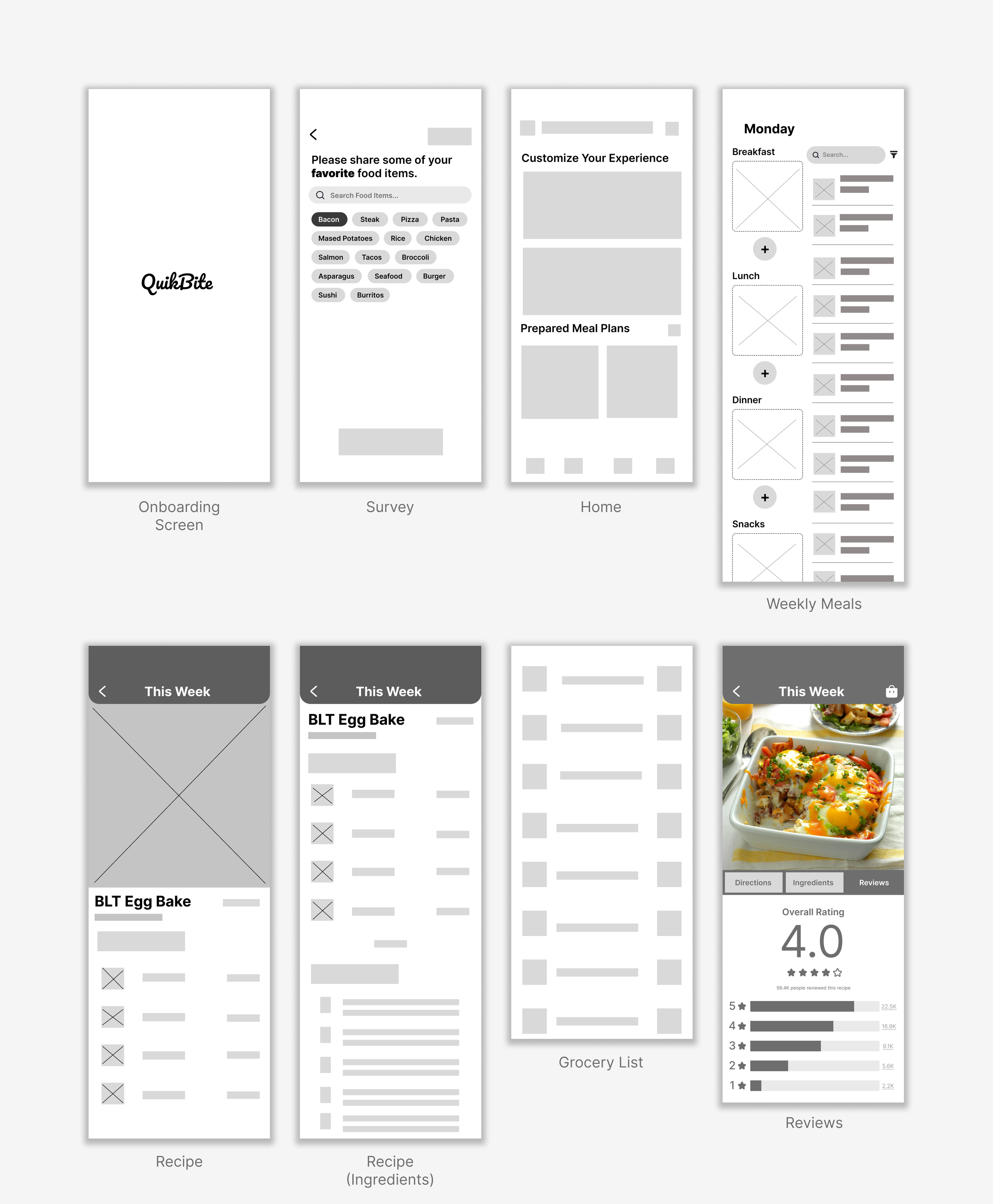
v. Design Process
The design process started with low-fidelity wireframes because I wanted to focus on making the experience actually work before worrying about making it look good. Early on, the goal was figuring out user flow, organization, and how to make interactions feel as simple and frictionless as possible instead of getting distracted by colors and aesthetics too soon. Once the core experience felt solid, I started exploring the visual direction through different layouts, color palettes, and overall styles to find something that matched the feel of the app naturally. I wanted the visuals to support the experience, not carry it.
Lo-Fidelity Wireframes
Mid-Fidelity Improvements
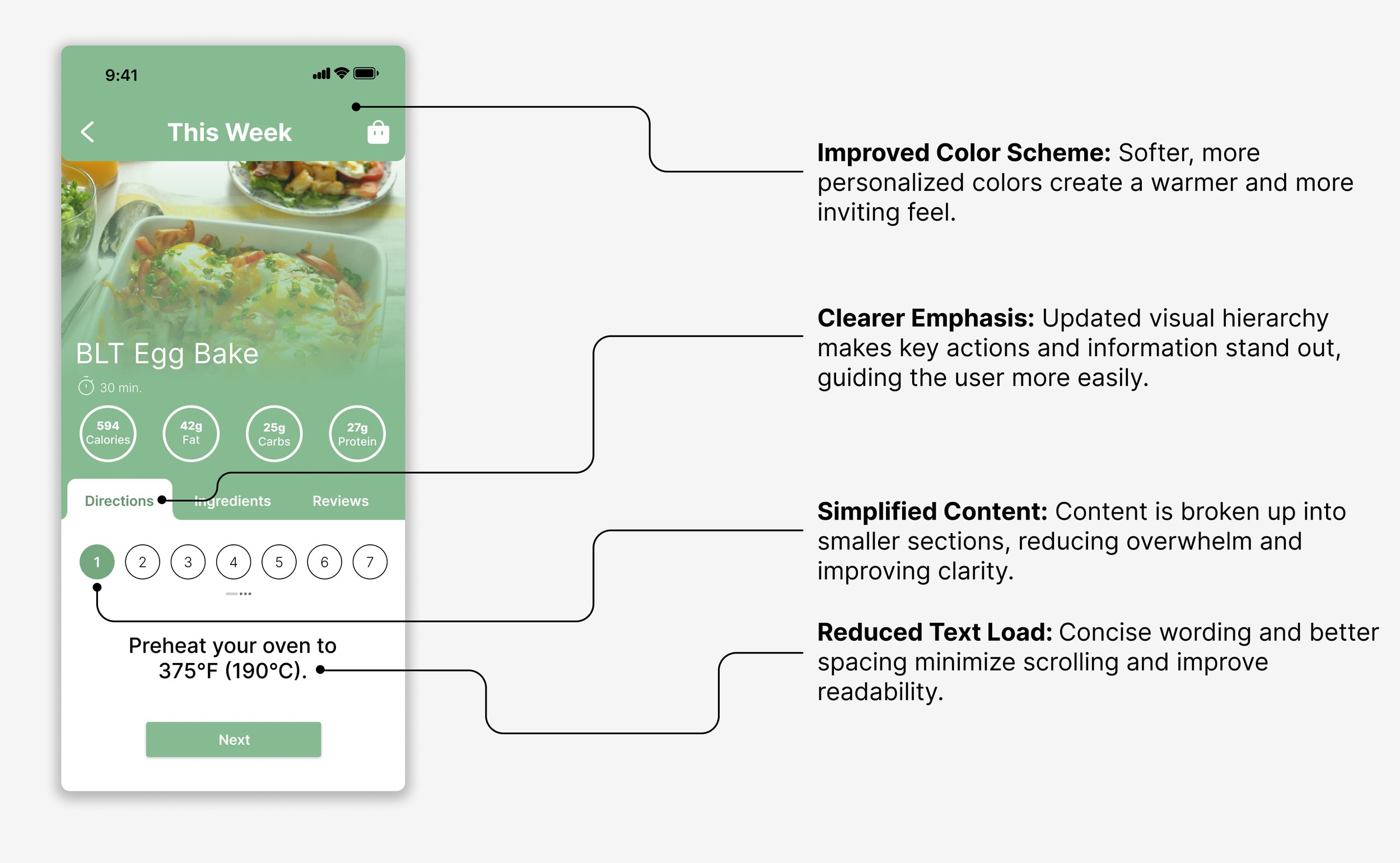
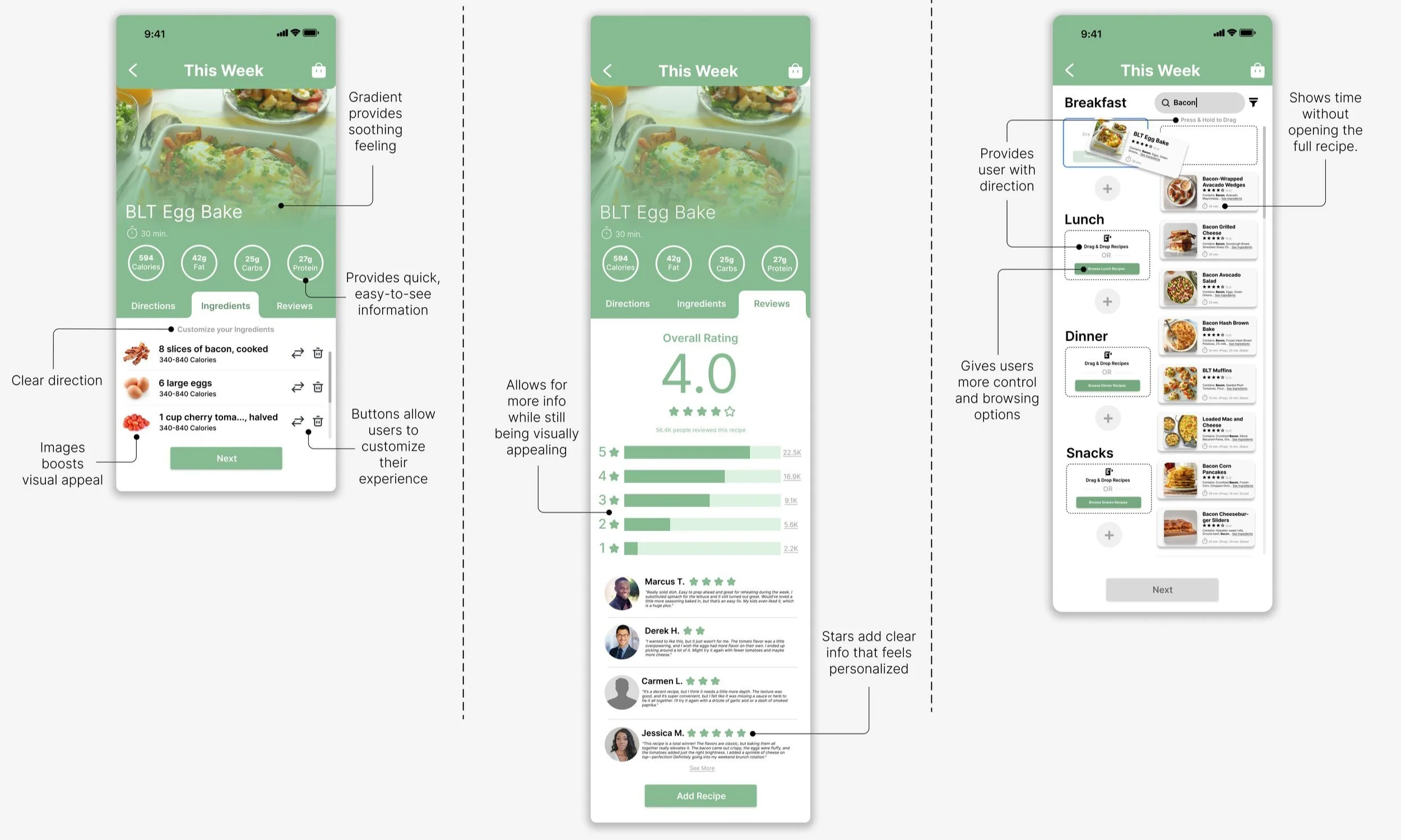
At this stage, I refined QuikBite’s structure and functionality while exploring color and branding. Balancing form and function helped connect early wireframes to the final high-fidelity design. You can see annotations after review from peers and myself which ultimately help me reach the final product.
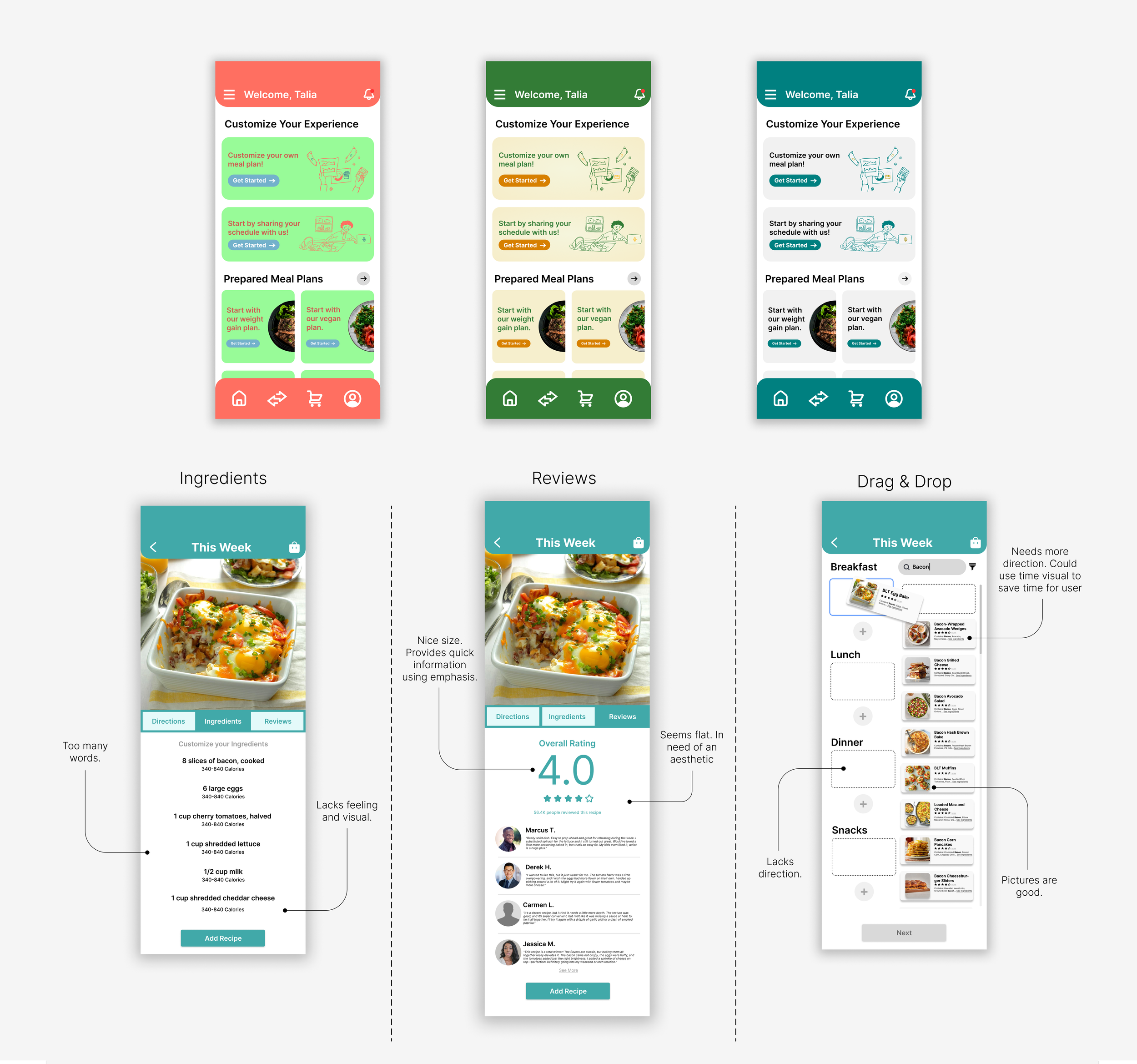
Hi-Fidelity Design Breakdown
In these frames, I introduced color to highlight key actions and make the journey more intuitive. By breaking content into smaller portions, I improved on-screen clarity and efficiency. These ideas were then tested with a new group of 10 users.
vi. Testing Usability
I tested the product with 10 participants across low, mid, and high-fidelity stages to see how naturally users could move through the experience and where friction started showing up. Users completed core tasks like finding ingredients, organizing meals, navigating tabs, and following preparation instructions while I observed where they hesitated, got confused, or overcomplicated simple actions. I also used follow-up questions and simple ranking systems to gather feedback on things like navigation clarity, layout, readability, and overall usability. A lot of the improvements came from noticing small behaviors in real time — like users tapping multiple times, slowing down, or needing extra clarification — which helped me simplify flows, improve hierarchy, and make the overall experience feel smoother and easier to follow.
Low/Mid-Fidelity Results
Create a weekly meal plan
50%
Add ingredients manually
0%
Export grocery list
0%
Edit meal plan
Problem
Low discoverability of core features
Unclear feedback after saving meals
Cognitive overload on meal creation screen
Manual ingredient entry felt repetitive
Navigation confusion between tabs
50%
Task
Success Rate
90%
100%
90%
100%
Avg. Time (mins)
8.1
Task
Success Rate
“…had no option to customize.”
Feedback
“Too much clutter”
N/A
N/A
Root Cause
“…was no option to download.”
6.9
Icons weren’t labeled; placement was inconsistent
No confirmation message or visual state change
Introduced notifications and progress indicators
Too many options visible at once
No predictive search or auto-fill
Inconsistent iconography
Create a weekly meal plan
Add ingredients manually
Export grocery list
Edit meal plan
“I didn’t know what to do.”
Feedback
Added text labels and standardized button
Implemented step-by-step flow
Feedback
“Love the suggested replacements”
“…quick and easy.”
4.6
“I didn’t have to think.”
Added smart suggestions based on recipe data
Consolidated navigation into 3 main tabs with clear labels
High-Fidelity Results
Avg. Time (mins)
6.5
“…clearer directions…”
5.2
3.8
vii. Final Iteration
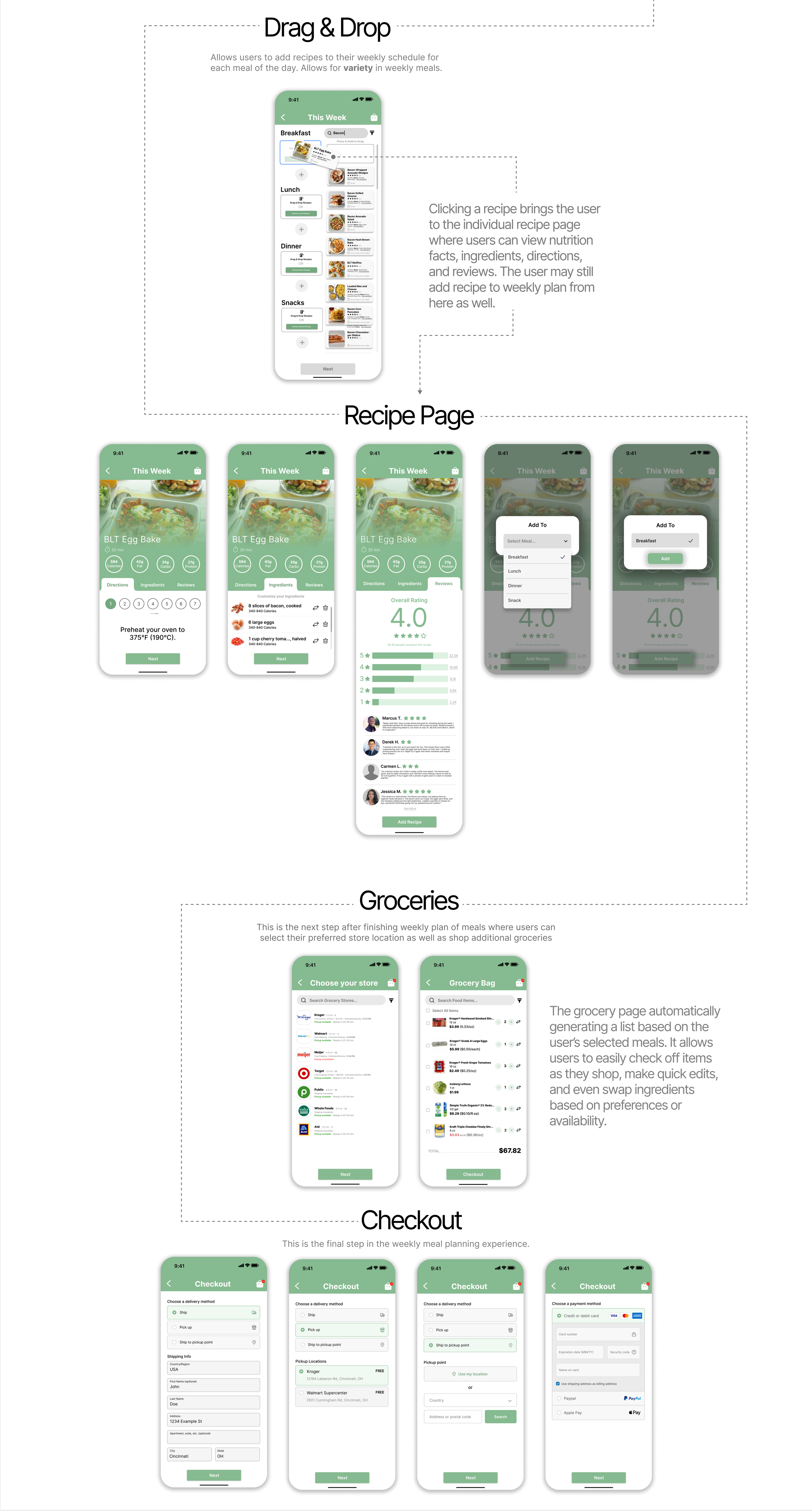
This is the final design for QuikBite after receiving feedback from peers and users.
viii. Usability Metrics
Average time to plan weekly meals
42 minutes
Time to add ingredients to grocery list
10 min
Task success rate (completing meal plan for the week)
55%
Error rate (missed or duplicate ingredients when shopping)
23%
System Usability Scale (SUS)
Net Promoter Score (NPS)
App satisfaction rating
Feature most valued
After QuikBite
12 minutes
Metric
Before QuikBite
80% faster
Improvement
71% faster
2 min
90%
+40% success rate
4%
82% reduction
User Satisfaction & Engagement
Result
88/100 – “Excellent” usability
+58 – strong advocacy
4.7 / 5 average
Auto-generated grocery list
ix. What Went Well?
User testing helped identify where meal planning felt overwhelming, leading to improvements such as the drag-and-drop weekly planner, simplified recipe organization, and clearer navigation between meals and recipes. Iterating on these features through multiple testing rounds helped create a smoother experience that reduced friction and made weekly meal planning feel more manageable.
x. What Didn’t Go Well?
Several early concepts prioritized features over usability, resulting in screens that felt cluttered and slowed users down. Testing revealed that users valued speed and clarity more than additional functionality, which required removing features, simplifying layouts, and refining task flows. This reinforced the importance of designing around user goals rather than adding complexity for the sake of features.